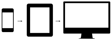
What is a Responsive Web Design (RWD)?
Responsive Web Design is a web design approach to provide optimal user experience for all mobile devices (phones/tablets), orientations (landscape/portrait) and computers (desktops/laptops) using one single website for all.
>>> As opposed to use different websites for mobile devices and for computers.
Responsive Layout
Responsive Layout = Fluid Layout (%) + Flexible Image (%) + Adaptive Layout (Breakpoints)
- Fluid Layout: Layout built using relative units for widths (such as percentages) as a result, columns are relative to one another allowing the browser to scale it up and down fluidly.
>>> As opposed to Fixed Layout which has a set width (such as pixels) and resizing the browser or viewing it on different devices won’t affect on the way the website looks. - Flexible images: Also use relative units for widths (such as percentages) so images are scaled automatically to fit its container for all devices.
- Adaptative Layout: Use of Media Queries to target specific device sizes.
- Media queries: Use of predefined sized (Breakpoints) where different layouts are triggered to control the design and its content as it scales down or up with the browser or device.
Mobile First
As browsers of basic mobiles do not understand JavaScript or media queries, the recommended practice is to create a basic website and enhance it for smart phones, tablets and Desktops.
- Progressive Enhancement: Approach focusing on the content which is the reason we create websites. Is a more appropriate paradigm by applying technologies in an intelligent way, layer-upon-layer. This doesn’t require that you provide the same experience in different devices.
>>> As opposed to Graceful Degradation that focuses on building the website for the most advanced/capable devices. - Unobtrusive Javascript: Way of writing JavaScript so that your website visitors are not shut out if browser doesn’t support Javascript or is turned off or even if your JavaScript is not working correctly for them, they should still be able to use your website and see its contents, albeit at a more basic level. Separate Contents from Behaviour.
It is really a nice and helpful piece of information. I’m happy that you shared this useful info with us. Please keep us informed like this. Thanks for sharing.
Thank you for sharing and for your feedback.
Wow, awesome blog layout! How long have you been blogging for? you make blogging look easy. The overall look of your website is excellent, as well as the content!|
Thank you, I like to make easy to read all my posts.
Excellent article! We will be linking to this great article on our site. Keep up the good writing.|
Thank you for your feedback.
What a great and honest read, thank you for sharing and using real language!,
Thank you, I think simplicity sometimes is key!